KaiOS Tech Case
Making digital experiences accessible beyond smart feature phones
Making digital experiences accessible beyond smart feature phones

Context
KaiOS is a US-based company with offices across Europe, Asia, and Brazil. It originated from the Firefox OS open-source project and became independent from Mozilla in 2016. KaiOS is a web-based operating system designed for affordable feature phones with limited hardware, while still providing access to essential apps and digital services.
Our goal was to bring internet access and technology to people in emerging markets.
In 2017, 54% of the world’s population was still offline.
KaiOS is a US-based company with offices across Europe, Asia, and Brazil. It originated from the Firefox OS open-source project and became independent from Mozilla in 2016. KaiOS is a web-based operating system designed for affordable feature phones with limited hardware, while still providing access to essential apps and digital services.
Our goal was to bring internet access and technology to people in emerging markets.
In 2017, 54% of the world’s population was still offline.


My role
I led KaiOS’ Brazilian UX team, working remotely with the Taiwan-based team. My role was to define navigation standards, support the development of core UI components, and design embedded apps for KaiOS devices. KaiOS later reached 175M+ devices across 150+ countries.
The biggest challenge for me was learning a completely new type of interaction. I had to forget almost everything I knew about touchscreen navigation and understand how people interacted with a physical keypad.
I grew up using keypad phones myself, but after years of using touchscreens, going back to that type of interaction felt almost like learning it from scratch.
I led KaiOS’ Brazilian UX team, working remotely with the Taiwan-based team. My role was to define navigation standards, support the development of core UI components, and design embedded apps for KaiOS devices. KaiOS later reached 175M+ devices across 150+ countries.
The biggest challenge for me was learning a completely new type of interaction. I had to forget almost everything I knew about touchscreen navigation and understand how people interacted with a physical keypad.
I grew up using keypad phones myself, but after years of using touchscreens, going back to that type of interaction felt almost like learning it from scratch.

Design Process: Brazil <> Taiwan
Design Process: Brazil <> Taiwan
Together with the design lead in Taiwan, we defined how navigation would work across the system. My first task was to design the interaction between tabs. Without a touchscreen, users had to navigate left and right using the physical keypad and press a button to confirm their actions.
To establish these interaction patterns, I studied classic feature phones from brands like Nokia and Ericsson to understand how people navigated mobile interfaces before touchscreens. I also looked at smartphone operating systems to identify familiar digital patterns that could be adapted to a keypad-based experience.
Together with the design lead in Taiwan, we defined how navigation would work across the system. My first task was to design the interaction between tabs. Without a touchscreen, users had to navigate left and right using the physical keypad and press a button to confirm their actions.
To establish these interaction patterns, I studied classic feature phones from brands like Nokia and Ericsson to understand how people navigated mobile interfaces before touchscreens. I also looked at smartphone operating systems to identify familiar digital patterns that could be adapted to a keypad-based experience.


Typography for small screens
Typography for small screens
Our users had very different backgrounds and needs. Many were first-time internet users or people looking for a simpler and more affordable alternative to smartphones. We also had older users and people who relied on feature phones for work.
This made readability especially important. We were designing for small 240x320px screens, where content needed to be easy to scan and understand without taking too much space. Based on our benchmarking of mobile operating systems, we decided to use a sans-serif typeface and chose Open Sans as the system font.
Open Sans gave us good readability at small sizes, with open and clear letterforms, while also providing enough weights to create hierarchy across the interface. Its simple and neutral style also worked well across very different apps and services.
Our users had very different backgrounds and needs. Many were first-time internet users or people looking for a simpler and more affordable alternative to smartphones. We also had older users and people who relied on feature phones for work.
This made readability especially important. We were designing for small 240x320px screens, where content needed to be easy to scan and understand without taking too much space. Based on our benchmarking of mobile operating systems, we decided to use a sans-serif typeface and chose Open Sans as the system font.
Open Sans gave us good readability at small sizes, with open and clear letterforms, while also providing enough weights to create hierarchy across the interface. Its simple and neutral style also worked well across very different apps and services.

Final design
Final design
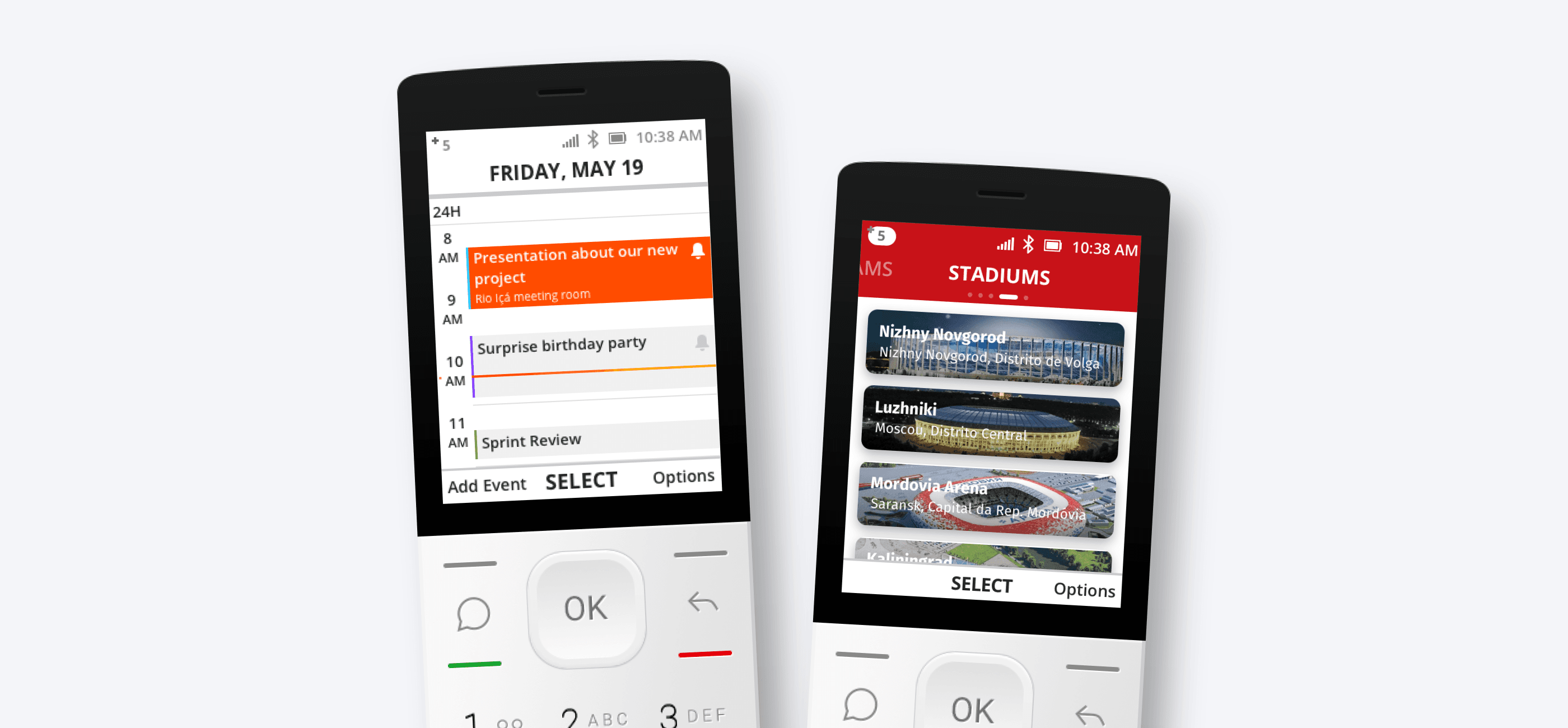
Due to contractual restrictions, I can’t share everything we worked on, but here are a few projects I had the opportunity to build as a UX Designer. For each one, we documented the complete user flows and UI components, helping us build consistent patterns that could be reused across the KaiOS ecosystem.
Due to contractual restrictions, I can’t share everything we worked on, but here are a few projects I had the opportunity to build as a UX Designer. For each one, we documented the complete user flows and UI components, helping us build consistent patterns that could be reused across the KaiOS ecosystem.
Global stocks
One of the apps I designed was a financial app for following stock market information. Because of the amount and complexity of the content, it became a good opportunity to explore different interaction patterns, including swipes, lists, and vertical menus, and understand how they would work with a physical keypad.
One of the apps I designed was a financial app for following stock market information. Because of the amount and complexity of the content, it became a good opportunity to explore different interaction patterns, including swipes, lists, and vertical menus, and understand how they would work with a physical keypad.


KaiOS New
KaiOS News was our first news app, bringing familiar smartphone patterns like carousels, banners, and full-screen ads to feature phones. Beyond expanding access to news, it also introduced new advertising opportunities, creating another way to monetize the KaiOS ecosystem.
KaiOS News was our first news app, bringing familiar smartphone patterns like carousels, banners, and full-screen ads to feature phones. Beyond expanding access to news, it also introduced new advertising opportunities, creating another way to monetize the KaiOS ecosystem.

KaiOS Maps
KaiOS Maps was one of our most challenging projects. Without reliable real-time GPS, the map API provided updated images only every few seconds. We designed animated transitions between these images to simulate continuous movement, creating a functional navigation experience from what was essentially a sequence of static map images.
KaiOS Maps was one of our most challenging projects. Without reliable real-time GPS, the map API provided updated images only every few seconds. We designed animated transitions between these images to simulate continuous movement, creating a functional navigation experience from what was essentially a sequence of static map images.

Browser

Result & Impact
Result & Impact
The impact went far beyond the products we designed. In just one year, KaiOS grew from 20M to more than 60M users, bringing affordable access to apps and digital services to millions of people.
More importantly, the platform expanded to over 100 countries, helping more people in emerging markets get connected to the internet for the first time. What started as the challenge of designing for small screens and physical keypads became part of a much bigger mission: making the digital world accessible to more people.
The impact went far beyond the products we designed. In just one year, KaiOS grew from 20M to more than 60M users, bringing affordable access to apps and digital services to millions of people.
More importantly, the platform expanded to over 100 countries, helping more people in emerging markets get connected to the internet for the first time. What started as the challenge of designing for small screens and physical keypads became part of a much bigger mission: making the digital world accessible to more people.
100
100
Countries
60M
60M
Users on the plataform
What I learned
What I learned
•Design is truly about solving problems and creating access
•Working across cultures makes you a better designer
•Constraints can lead to more creative solutions
What I’d do differently
• Understand behaviors and interaction patterns across countries before defining global standards
• Explore motion, feedback, transitions, and microinteractions as part of the OS experience
• Test navigation standards with real users before scaling them across apps and the entire ecosystem
•Design is truly about solving problems and creating access
•Working across cultures makes you a better designer
•Constraints can lead to more creative solutions
What I’d do differently
• Understand behaviors and interaction patterns across countries before defining global standards
• Explore motion, feedback, transitions, and microinteractions as part of the OS experience
• Test navigation standards with real users before scaling them across apps and the entire ecosystem
